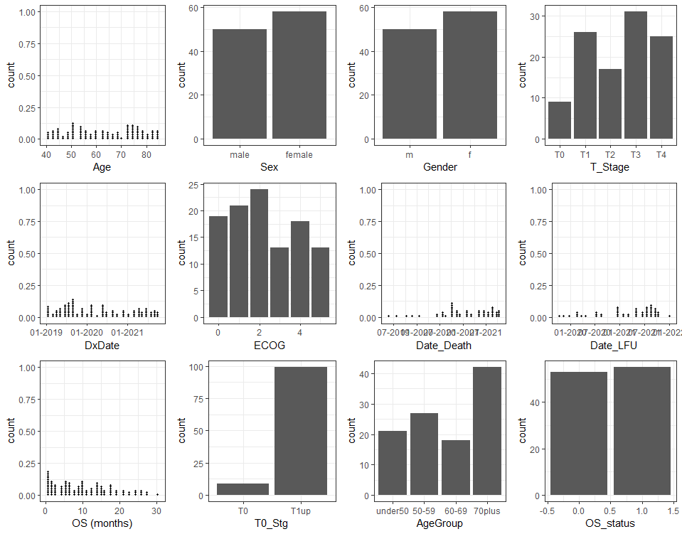
3.3 PlotVariables
This is a simple function to produce barplots for factor and integer data and dotplots for continuous data, so that outliers can be easily identified and to see the distribution of the data. If the data are survey data then combined variables may be created to detect common response patterns. These are automatically displayed as a Pareto graph.
Syntax
First the data needs to be imported:
import <- importExcelData(excelFile = 'C:/Users/lisa/OneDrive - UHN/reportRxTestData/testData.xlsm',saveWarnings = T)
data <- import$data
Then the plots can be created:
varPlots <- plotVariables(data)
To view them in the plots view:
print(varPlots)
Each variable will be shown separately, the arrows at the top left of the Plots screen can be used to scroll through the plots
To show them all together on one page you can use the ggpubr package:
ggpubr::ggarrange(plotlist=varPlots)
 # Information for Users of the Data Dictionary
Good science requires good data!
This is a guide to using the Excel macro-enabled template DataDictionary.xlsm
What isn’t entered can’t be analysed, but conversely, there is no need to provide multiple variables containing the same information (ie age and age categories).
General Tips:
- There can only be one header row
- One row per record, one column per piece of information
- Statistics programs can not read comments, decipher different colours or other text formatting. Do not use these for information to be analysed, instead put the information is a separate column.
- Statistics programs are case-sensitive and require accurate data entry: the values m, M, male, Male and MALE are all different categories to a computer.